How it began 🎬
Melbourne welcomes a considerate amount of international students each year. Being new to Melbourne, most students do not know what to do when they face critical incidents such as fire hazards and mental health complications. There are messages that are given to students to raise awareness of existing services that can help them in these situations. However, because of various barriers such as English not being their first language, cultural differences or lack of knowledge in a particular context can make communicating important messages challenging for service providers.
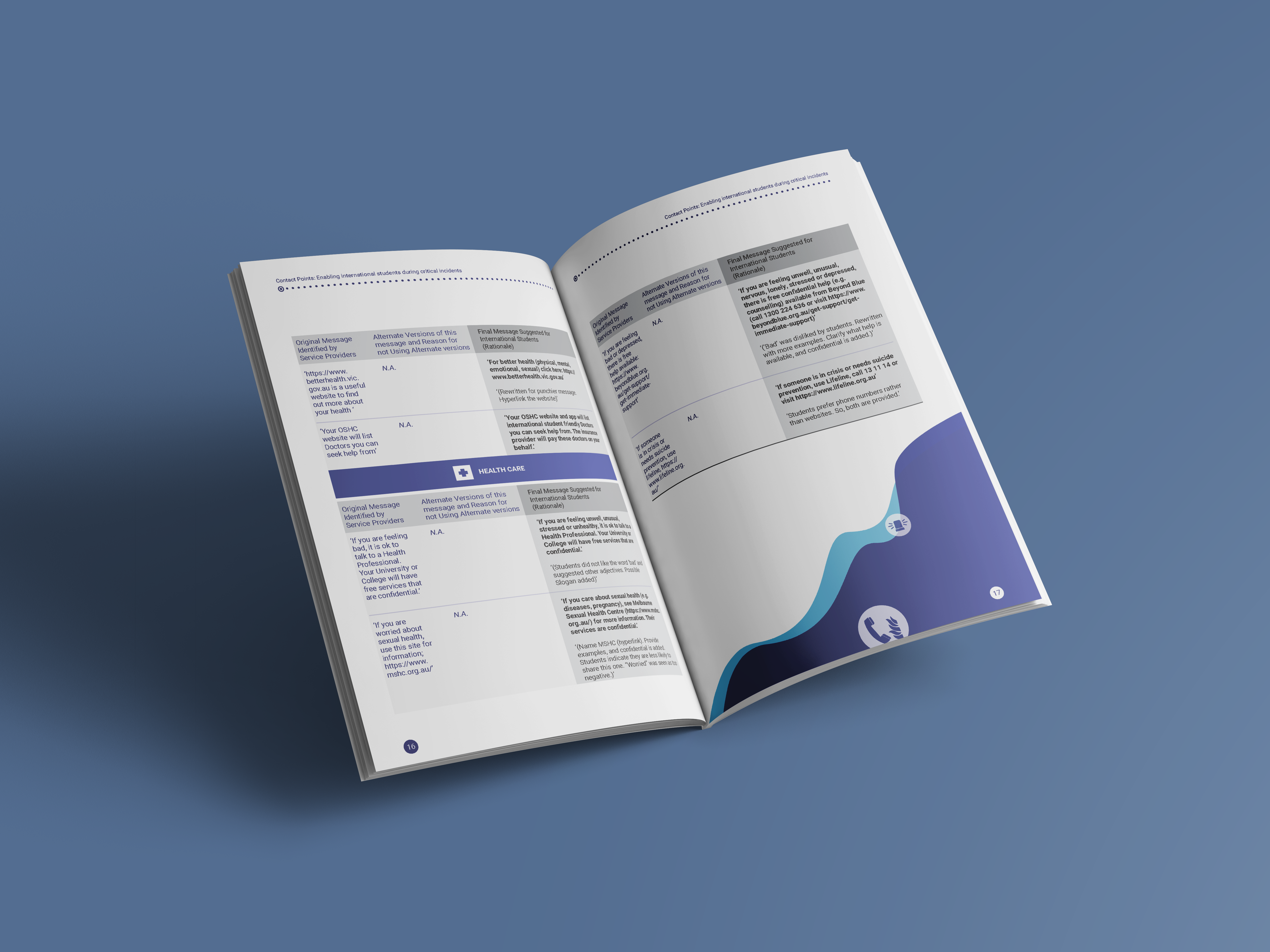
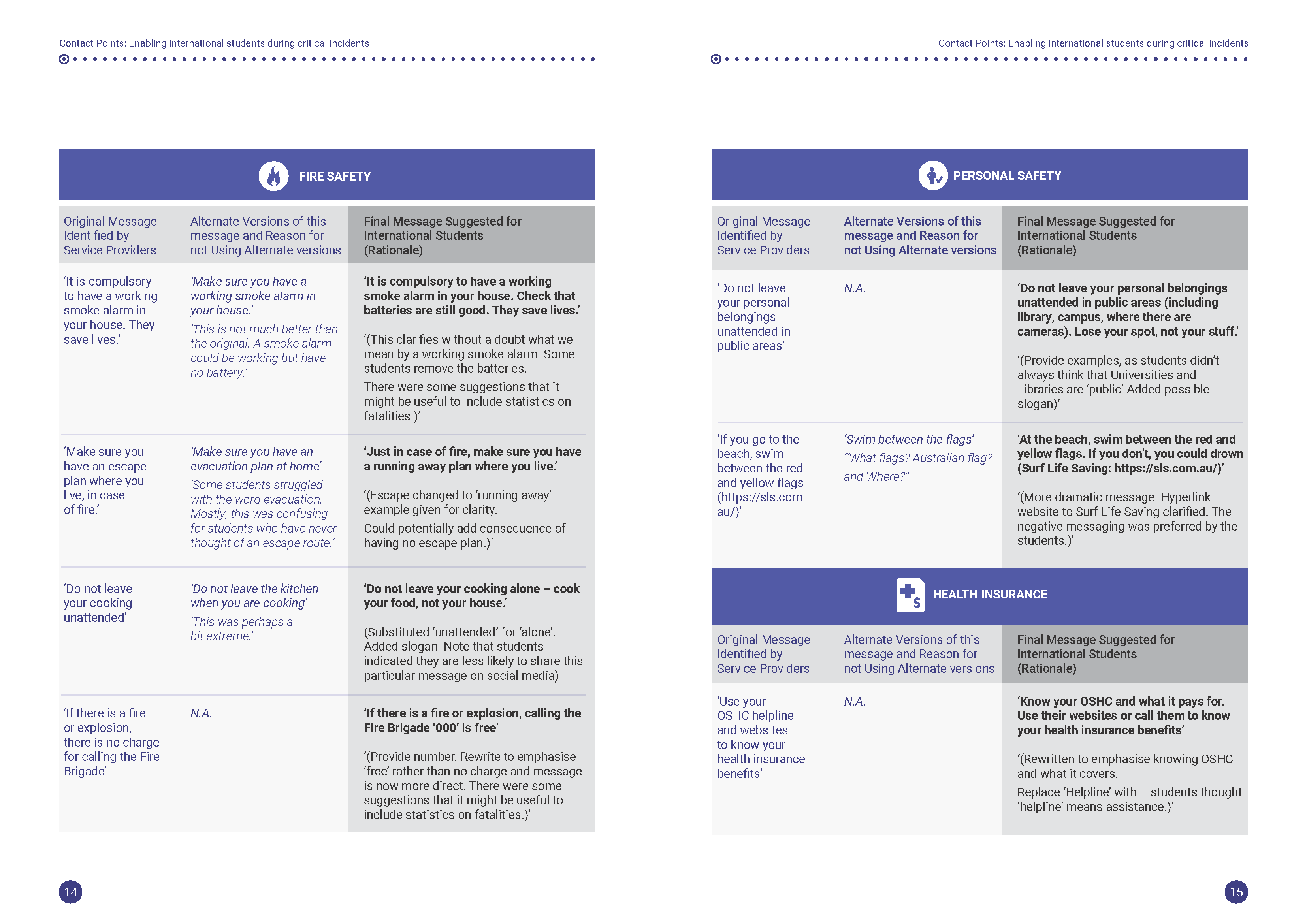
The Contact Project aims at addressing this issue and proposes different messages that service providers (universities, colleges, medical institutions, police, etc.) could use when communicating with international students. The outcome of the project is a set of 20 key messages designed to make it easier for international students to understand.
The final report was created to share the research process and results of the project to service providers. The aim is to encourage and help service providers to communicate better critical incident messages to their students. It has to be noted that the project focused only on the messages. Service providers were encouraged to add visuals to make these messages more appealing to students.
The design process ⏳
Designing the report 📝
When I was asked to be the graphic designer of the report, I was both excited and stressed. Excited to be part of such an interesting and unique project and stressed because it was my first report design (that was not related to my university assignments). Even though I worked on other graphic design work previously, I was not as confident in my design skills. I think that a part of me still fears that not being formally taught in graphic design would have been an issue. (Yes, I am studying Industrial Design but my course does not include graphic design classes. I self-taught myself how to use the Adobe Suite.) However, seeing how people, especially Manorani Guy (Mano), believe in my capability encouraged me to take up the challenge and to try my best.
Even though I was not part of the project since the beginning, collaborating with Catherine, Shanton and Mano gave me the opportunity to learn a lot more about the project than just reading the content that was given to me. Before starting on the design, we arrange a casual meeting to discuss more what kind of design the team has in mind. I prepared some questions that I would like clarification and also some images of existing reports that could be used as inspirations.
These are some of the things that we discussed:
- The aims of the report. Why are we designing a report? Who will read the report? How will it be shared? Are we going to print them?
- What is the deadline? By when do we need a draft? How many days will it take to print it?
- What is the colour combination we would like? Will it match the logos of the different contributors, sponsor, and partners?
- What are some of the limitations that we should be aware of? For example, visuals/images that are not allowed, design guidelines of when using organisations’ logos.
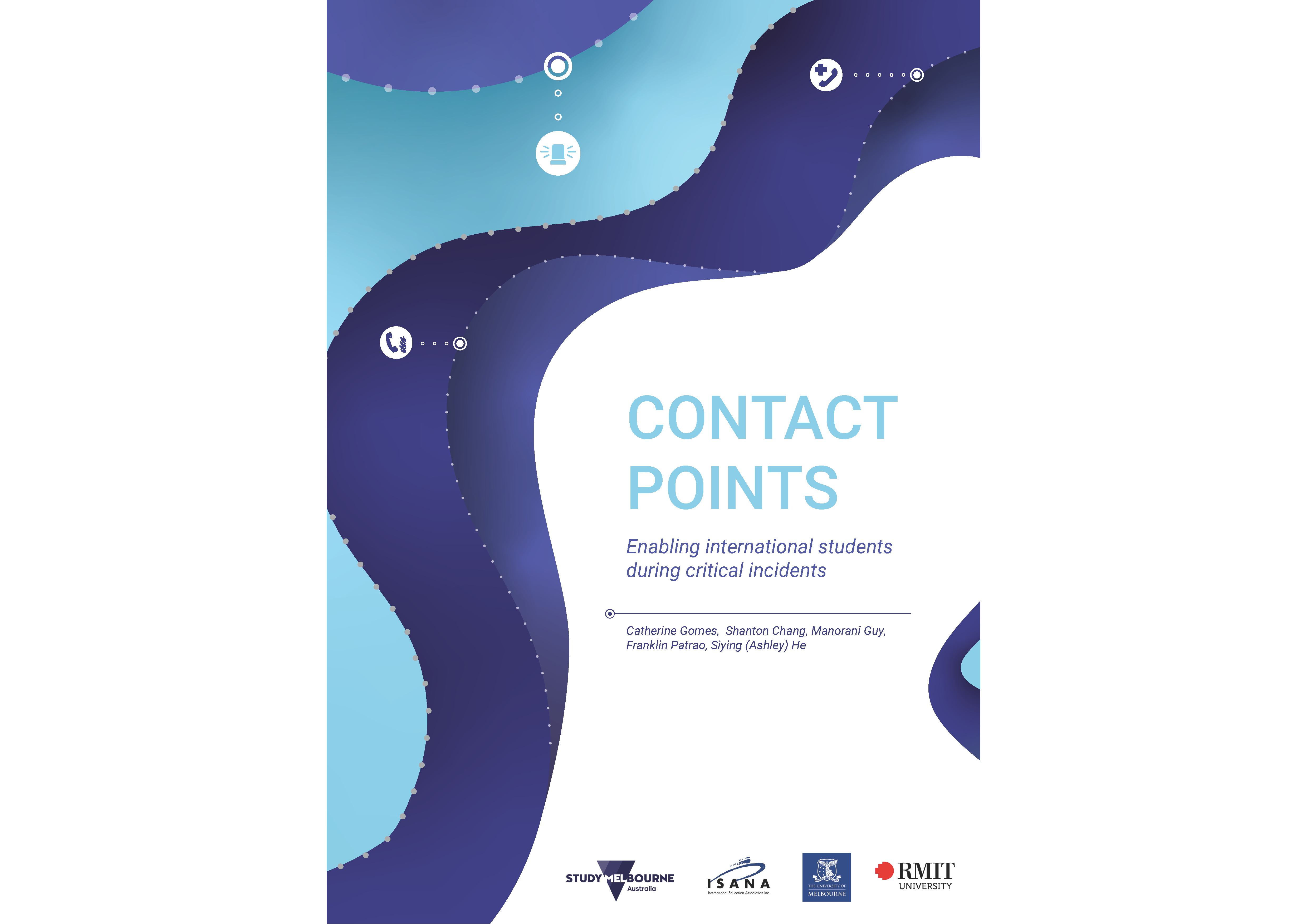
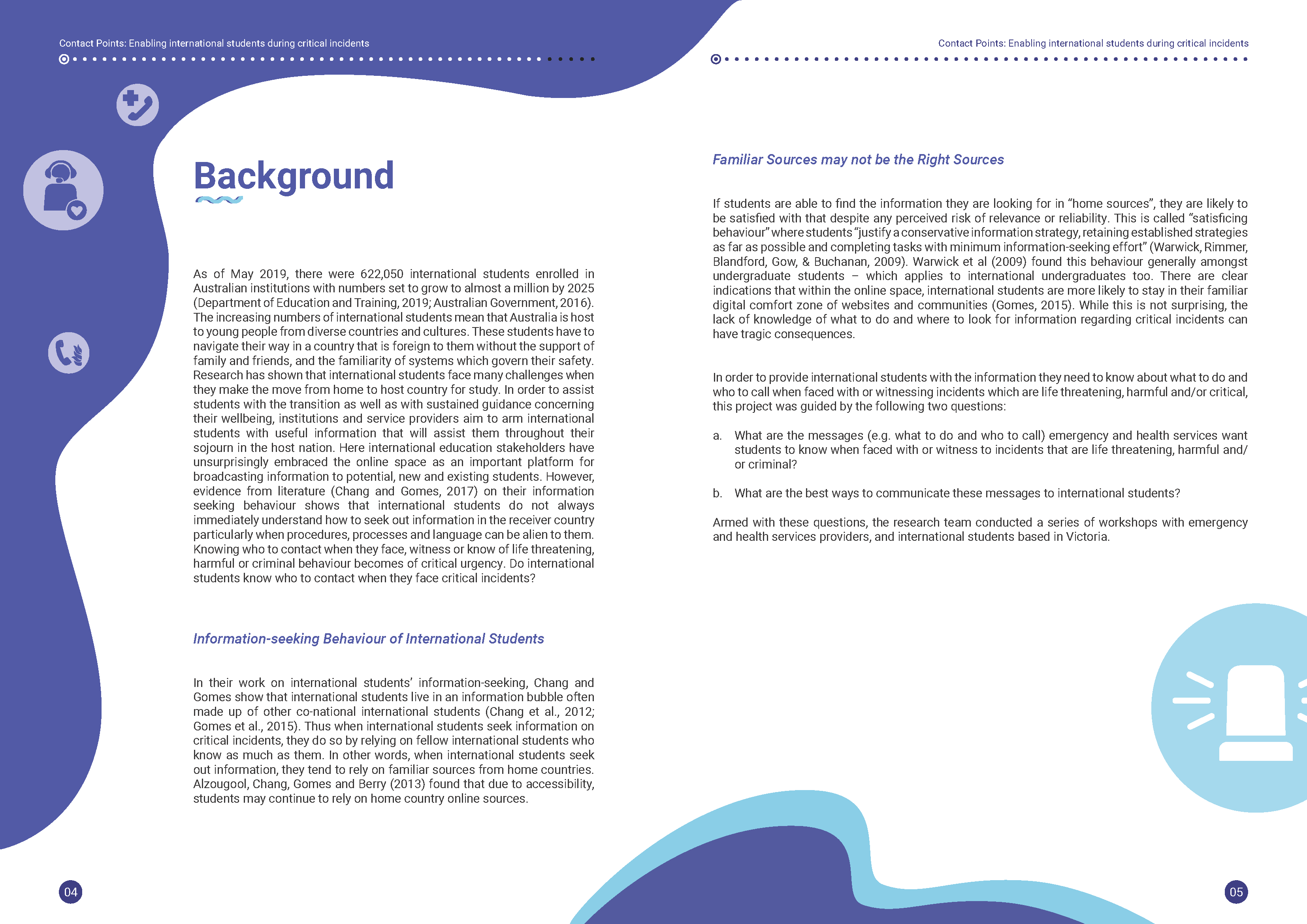
After getting the information needed to start the report design, I started to do a quick sketch on paper of the cover, layout of the different elements of the page. I used Adobe Illustrator to design the front and back cover of the report and the icons used in the report. Adobe Indesign was used for the report layout. After finishing the first draft, I shared it with the team and made changes based on the feedback that I received. During this iteration process, more than one draft was created.
The Outcome 📸
Short description of the chosen design
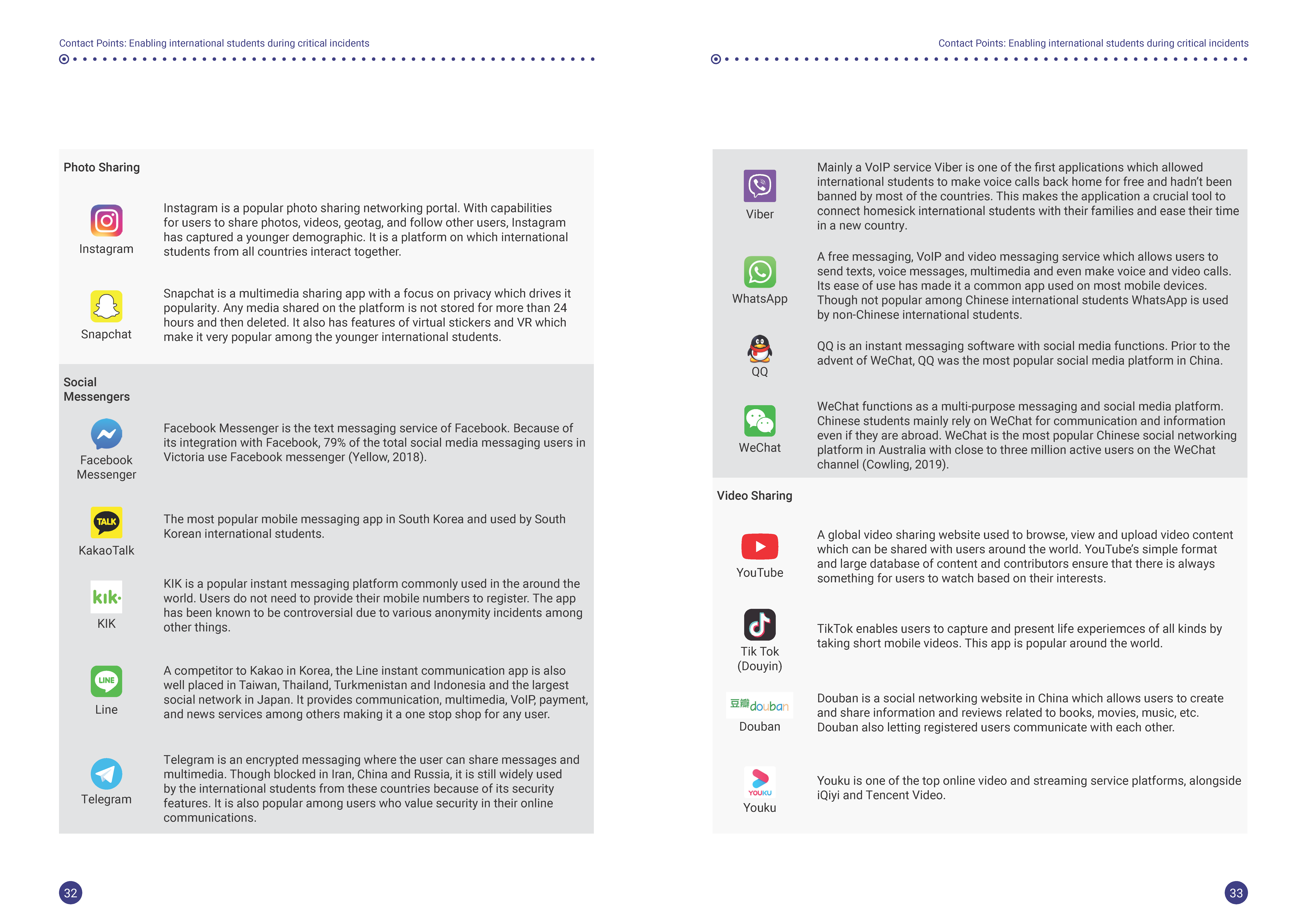
The curved/flexible style of the lines found on the cover and inside of the report represents the journey of the international student. These lines are curves to show how the journey is a non-linear one. The dots represent the various events encountered by students and the bigger dots are the critical incidents. The icons are some of the kinds of critical incidents such as calling the ambulance, fire hazards, etc. The different shades of blues and purples are a nice combination that goes well with the white background. The logos of the different organisations can also be easily spotted and recognised.
Personal learnings 🌱
What I got out of being involved in this project was to meet new people and to discover new issues that international students are facing. Previously, critical incidents of messages seemed so simple and easy to understand. But after this project, I am more aware of how important it is to test messages with different users, especially those who are most likely to have difficulties. Learning about the research process of the project, especially the involvement of students and representatives of service providers, is also very interesting. I also now have more confidence in my graphic design skills even if I have no graphic design degree. Learning new skills by watching You-Tube videos and practising using these skills really contribute to upskilling oneself.
The prototyping phase taught me about the CNC process which was used to create the final prototype. The prototype is also the biggest prototype I have done so far and I was a bit afraid of being too ambitious and not being able to finish on time. There were times when I thought that I should just do a smaller scale version. However, I knew that I would not be satisfied with the outcome and decided to take the challenge. I had a good support group (especially the workshop staff) that helped me in the making and assembling the prototype structure. For the electronic aspect, I solder a circuit for the first time and it was tedious but weirdly fun to label the wires and making sure the circuit components are connected properly.
Finally, this studio was a good way to learn some of the ways of utilising data. Nowadays, big data is a popular topic and many organisations and businesses are already using data to develop new product and services. Of course, this leads to lots of discussions and ethical considerations about what kind of data is used, how it is collected, used and why. This is certainly an area that I would like to explore more in the future.
Acknowledgement 🎊
I would like to acknowledge ISANA and Study Melbourne and the
contributors of the Contact Points Project and report:
Catherine Gomes (Associate Professor from RMIT University),
Manorani Guy,Shanton Chang (Associate Professor from The University of
Melbourne),
Siying He (Ashley)
and AUSRecent.
Thank you Mano, Shanton and Catherine for the opportunity to design the final report of this project!
